Plotly は、ホバー・ズーム・パン操作が標準で効くインタラクティブなチャートを作れる可視化ライブラリです。matplotlib が「見せる絵」に強いのに対し、Plotly は「操作できる絵」「Web に埋めるための絵」に強みがあります。
本記事では、plotly.graph_objects を使ったローソク足チャートの作り方、移動平均と出来高サブプロットの追加、HTML 出力までを順に確認します。
目次
- インストール
- Plotly Express と Graph Objects
- サンプルデータ
- Plotly Express で折れ線
- ローソク足(Graph Objects)
- 移動平均を重ねる
- 出来高サブプロットを足す
- ホバーラベルの調整
- HTML への埋め込み
- 静的画像で書き出す
インストール
pip install plotly pandas検証バージョン: Python 3.12.5 / Plotly 5.24.1 / pandas 2.2.3
Plotly Express と Graph Objects
Plotly には 2 種類のインターフェースがあります。
| 名称 | 性質 |
|---|---|
plotly.express(px) | 1 行でグラフを作る簡易 API。データフレーム前提 |
plotly.graph_objects(go) | 細かい指定が可能な低レベル API。サブプロット・複合チャート向き |
折れ線・散布図のような単純なグラフは px、ローソク足やサブプロット構成は go が向きます。
サンプルデータ
import numpy as npimport pandas as pd
rng = np.random.default_rng(11)dates = pd.date_range("2026-01-05", periods=80, freq="B")close = 2900 + rng.normal(0, 30, len(dates)).cumsum()
df = pd.DataFrame({"Date": dates, "C": close})df["O"] = df["C"].shift(1).fillna(df["C"]) + rng.normal(0, 5, len(dates))df["H"] = np.maximum(df["O"], df["C"]) + np.abs(rng.normal(0, 8, len(dates)))df["L"] = np.minimum(df["O"], df["C"]) - np.abs(rng.normal(0, 8, len(dates)))df["Vo"] = rng.integers(8_000_000, 15_000_000, len(dates))df["sma25"] = df["C"].rolling(25).mean()print(df.head())Plotly Express で折れ線
最初はシンプルな折れ線です。
import plotly.express as px
fig = px.line(df, x="Date", y="C", title="C (synthetic)")fig.write_html("close_line.html")fig.write_html で出力すると、ブラウザで開ける単一の HTML ファイルになります。fig.show() を呼ぶと、Jupyter なら直接表示、ローカル Python なら標準ブラウザで開きます。
ローソク足(Graph Objects)
ローソク足は go.Candlestick で描きます。
import plotly.graph_objects as go
fig = go.Figure(data=[ go.Candlestick( x=df["Date"], open=df["O"], high=df["H"], low=df["L"], close=df["C"], name="OHLC", )])fig.update_layout( title="OHLC (synthetic)", xaxis_title="Date", yaxis_title="Price (JPY)", xaxis_rangeslider_visible=False,)fig.write_html("candle.html")xaxis_rangeslider_visible=False で、画面下に出る期間スライダーを消しています。レンジスライダーは便利ですが、サブプロットを足すと窮屈になるため、最初はオフが扱いやすいです。
移動平均を重ねる
go.Scatter を add_trace で追加すると、ローソク足に線を重ねられます。
fig = go.Figure()fig.add_trace(go.Candlestick( x=df["Date"], open=df["O"], high=df["H"], low=df["L"], close=df["C"], name="OHLC",))fig.add_trace(go.Scatter( x=df["Date"], y=df["sma25"], mode="lines", name="SMA(25)", line=dict(color="orange", width=1.4),))fig.update_layout( title="OHLC with SMA(25)", xaxis_rangeslider_visible=False, template="plotly_white",)fig.write_html("candle_sma.html")template="plotly_white" は白背景のテーマです。他に "plotly_dark"、"simple_white"、"ggplot2" などが用意されています。
出来高サブプロットを足す
価格と出来高を上下に並べるには make_subplots を使います。
from plotly.subplots import make_subplots
fig = make_subplots( rows=2, cols=1, shared_xaxes=True, row_heights=[0.7, 0.3], vertical_spacing=0.03, subplot_titles=("Price", "Vo"),)
fig.add_trace( go.Candlestick( x=df["Date"], open=df["O"], high=df["H"], low=df["L"], close=df["C"], name="OHLC", ), row=1, col=1,)fig.add_trace( go.Scatter(x=df["Date"], y=df["sma25"], name="SMA(25)", line=dict(color="orange", width=1.4)), row=1, col=1,)fig.add_trace( go.Bar(x=df["Date"], y=df["Vo"], name="Vo", marker=dict(color="lightgray")), row=2, col=1,)
fig.update_layout( title="Price and Vo", template="plotly_white", xaxis_rangeslider_visible=False, height=600,)fig.write_html("price_volume.html")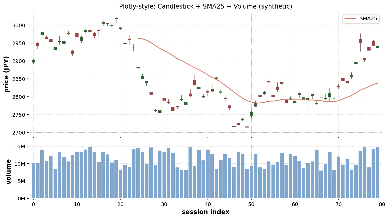
shared_xaxes=True で x 軸を共有し、価格と出来高を時間軸で揃えます。row_heights で 7 : 3 の比率にしています。
ホバーラベルの調整
ホバー(マウスを乗せたときの吹き出し)は Plotly の魅力ですが、デフォルトのままだと表示が冗長になりがちです。hovertemplate で書式を指定できます。
fig.update_traces( selector=dict(type="scatter"), hovertemplate="Date: %{x|%Y-%m-%d}<br>Value: %{y:,.1f}<extra></extra>",)%{y:,.1f} は「3 桁区切り、小数 1 桁」、<extra></extra> でトレース名のラベルを消しています。
HTML への埋め込み
fig.write_html の出力には Plotly の JavaScript ライブラリが含まれるため、単独で 3〜4 MB 程度になります。サイトに埋め込むときの選択肢を表にまとめます。
| 方法 | 特徴 |
|---|---|
write_html(full_html=True)(既定) | 単独で動く HTML ファイル。サイズ大 |
write_html(full_html=False) | <div> だけ出力。ページ側で plotly.js を読み込み |
write_html(include_plotlyjs="cdn") | plotly.js を CDN から読み込む。サイズ小 |
to_json() | JSON だけ出して、フロントエンドで描画 |
ブログ・ドキュメントに静的に埋めるなら include_plotlyjs="cdn" が、ファイルサイズと表示速度のバランスが良いです。
fig.write_html("price_volume_cdn.html", include_plotlyjs="cdn", full_html=True)静的画像で書き出す
レポート用に PNG / SVG が欲しい場合は kaleido を追加でインストールして write_image を使います。
pip install kaleidofig.write_image("chart.png", width=1200, height=600, scale=2)scale=2 は Retina 相当の解像度です。
生成AI へのプロンプト例
Plotly はオブジェクト構造が独特なので、構成を箇条書きで明示すると安定します。
Plotly の make_subplots でローソク足チャートを作るコードを書いてください。
入力:- df(列: Date, O, H, L, C, Vo, sma25, sma75)
要件:- 上段: ローソク足 + SMA(25) + SMA(75)(SMA は色違いの線)- 下段: 出来高(棒、薄いグレー)- 行高比 7:3、x 軸共有、レンジスライダー非表示- テンプレートは "plotly_white"- write_html("chart.html", include_plotlyjs="cdn", full_html=True) で保存- Plotly 5.24 系
「サブプロット構成」「色」「テンプレート」「保存方式」を順に書けば、再現性のあるコードが返ります。
まとめ
- Plotly Express は単純なグラフ、Graph Objects は構成の細かい指定向き
- ローソク足は
go.Candlestick、線の重ねはadd_trace(go.Scatter)、出来高はgo.Bar - サブプロットは
make_subplots(rows, cols, shared_xaxes=True)で組む - HTML への埋め込みは
include_plotlyjs="cdn"がバランス良い - 静的画像は
kaleidoを入れてwrite_image